The Impact of Color Schemes on Web Design: Enhancing Brand Identity and User Experience in 2023

In today’s digital age, it is more important than ever to create a website that stands out in the sea of online content. A website’s design plays a significant role in capturing a user’s attention and guiding them through the site. One of the most influential tools that a designer has at their disposal is color. Color can set the tone for a brand, influence its image, draw user attention, affect their emotions, and increase usability [1]. This article will explore the impact of color schemes on web design and how they can enhance brand identity and user experience.
Table of Content: The Impact of Color Schemes on Web Design
Understanding Color Theory
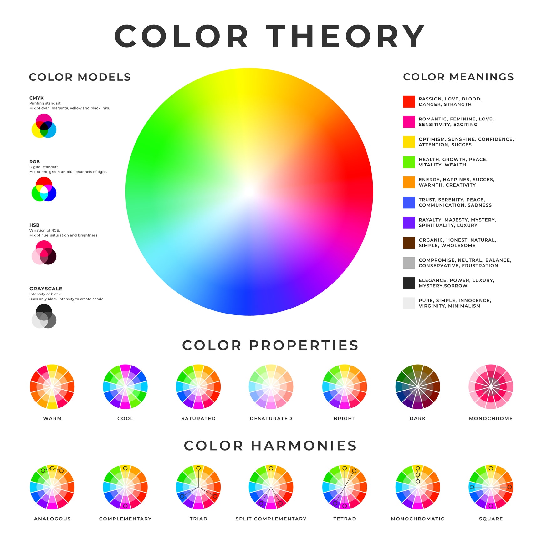
Before delving into the impact of color schemes on web design, it is essential to understand color theory. The color wheel is a fundamental tool that designers use to create effective color combinations. The color wheel is a circular chart that displays the primary, secondary, and tertiary colors in a visually appealing way. Understanding color relationships is essential when creating color schemes. Complementary colors, for example, are opposite each other on the color wheel and create high contrast when used together. Analogous colors, on the other hand, are adjacent to each other and create a more harmonious look when combined [1].

Importance of Color Schemes in Web Design
Choosing the right color scheme is crucial in web design, as it can have a significant impact on a website’s overall success. A well-chosen color scheme can help visitors understand and navigate the site, improve their online experience, and enable them to find the information they need quickly [2].
Additionally, color schemes can help create a consistent brand identity across all online platforms. Using the same colors in all aspects of a brand, including websites, social media, and marketing materials, can help customers recognize and remember a company more easily [3].
Choosing the Right Color Scheme
Choosing the right color scheme for a website requires a good understanding of the brand, its target audience, and the website’s purpose. The brand’s values and personality should be reflected in the color scheme. A brand that wants to be perceived as trustworthy and professional may choose a color scheme with blues and grays, while a brand that wants to convey energy and excitement may choose a color scheme with bright, bold colors [2].
It is also important to consider the website’s purpose and target audience when choosing a color scheme. A website that sells luxury products may benefit from a color scheme with gold or silver metallic accents, while a website selling eco-friendly products may benefit from a color scheme with earth tones [3].
Impact of Color on User Experience
Colors can affect a user’s emotions and behavior on a website. For example, red is associated with urgency and can be effective in drawing attention to a call to action (CTA). Blue is a calming color and can be used to create a sense of trust and professionalism [1].
The use of color can also affect a website’s usability. A well-designed color scheme can help guide a user’s eye to important information on the site, such as navigation menus and CTAs. Using too many colors or a clashing color scheme can make a website look chaotic and make it difficult for users to find what they need [2]
Importance of Choosing the Right Color Scheme for Your Website
As previously mentioned, color can have a significant impact on a website’s overall design and user experience. Choosing the right color scheme can make or break a website’s success. In fact, a study conducted by the University of Loyola found that color can increase brand recognition by up to 80% [1]. This highlights the importance of selecting a color scheme that not only fits your brand identity but also resonates with your target audience.
Enhancing Brand Identity
Brand identity is one of the key elements that help businesses stand out in a crowded market. A consistent and cohesive color scheme can help reinforce brand identity and create a memorable impression. For instance, Coca-Cola’s iconic red and white color scheme is instantly recognizable and has helped the brand become one of the most successful companies in the world.
When choosing a color scheme for your website, it’s important to consider your brand identity and ensure that the colors you select align with your brand values and messaging. If your brand is known for being eco-friendly, for example, choosing shades of green and brown may help communicate that message to your audience.
A good example where you can see the effect of color on fire are Stylescapes / Moodboards 2.0.
Improving User Experience
In addition to enhancing brand identity, selecting the right color scheme can also improve user experience. Colors can affect users’ emotions and perceptions, which can influence their behavior on your website. For instance, warm colors such as red and orange can create a sense of urgency, making users more likely to take action [2].
Moreover, a well-designed color scheme can help guide users’ attention to important elements on your website. Using contrasting colors for buttons or calls to action, for example, can help them stand out and increase the likelihood of users taking the desired action.
Best Practices for Choosing a Color Scheme
Now that we’ve covered the importance of choosing the right color scheme for your website, let’s take a look at some best practices for selecting colors:
1. Consider Your Brand Identity
As previously mentioned, your brand identity should be the foundation of your color scheme. Consider your brand’s values, messaging, and personality to ensure that the colors you choose align with your brand.
Let me dive deeper into the psychology of color in web design and provide examples of how different colors can be used to elicit certain emotions and actions.
Red is often associated with energy, excitement, and urgency. It can be used to grab attention and create a sense of urgency, making it a popular choice for call-to-action buttons or sales promotions. However, too much red can be overwhelming and create a negative emotional response [4].
Blue is often associated with trust, stability, and calmness. It can create a sense of security and professionalism, making it a popular choice for financial institutions or healthcare providers. Blue can also promote productivity and concentration, making it a good choice for productivity apps or websites [5].
Green is often associated with nature, growth, and harmony. It can create a calming and relaxing effect, making it a popular choice for wellness or environmental websites. Green can also represent wealth and money, making it a good choice for financial planning or investment sites [4].
Yellow is often associated with happiness, optimism, and friendliness. It can create a cheerful and playful atmosphere, making it a popular choice for children’s websites or marketing campaigns. However, too much yellow can also create feelings of anxiety or frustration [5].
Orange is often associated with excitement, warmth, and creativity. It can create a sense of enthusiasm and energy, making it a popular choice for sports or entertainment websites. Orange can also be used to create a sense of urgency, similar to red [4].
Purple is often associated with luxury, creativity, and spirituality. It can create a sense of sophistication and elegance, making it a popular choice for beauty or fashion websites. Purple can also promote creativity and innovation, making it a good choice for creative agencies or art-related websites [5].
These are just a few examples of how different colors can be used in web design to elicit certain emotions and actions. It’s important to keep in mind that individual perceptions of color can vary, and cultural differences can also influence the meaning of colors. Therefore, it’s important for designers to understand their target audience and choose colors that are appropriate for their brand and goals.
2. Use Color Theory
Color theory is the science of how colors interact and how they can be used effectively in design. Familiarizing yourself with color theory can help you make informed decisions when selecting a color scheme.
- Hue: the actual color of an object (e.g., red, blue, green).
- Saturation: the intensity or purity of a hue.
- Brightness: the lightness or darkness of a hue.
- Contrast: the difference between two colors.
- Warm vs. cool colors
3. Limit Your Color Palette
While there is no set rule for how many colors to use in a color scheme, limiting your palette to a few well-selected colors can help create a cohesive and visually appealing design. A rule of thumb here can be “2 color combination for website”.
4. Consider Accessibility
It’s important to consider accessibility when selecting a color scheme. Ensure that your color choices are readable for users with visual impairments and that there is enough contrast between background and text colors.
4 AI-based tools that can help boost the use of color in creating a branding and logo design
Using these AI-based tools can help designers create unique and effective branding and logo designs that stand out in today’s competitive market. This “website color schemes generator” will help by answering the question, “What color scheme should I use for my website?”
Also, you can find a collection of AI Tools to Boost your Productivity here.

Canva
Canva is an easy-to-use graphic design platform that has a variety of color tools to help with branding and logo design. One of the standout features is its color palette generator, which uses AI to create a unique color palette based on an uploaded image.

Adobe Color
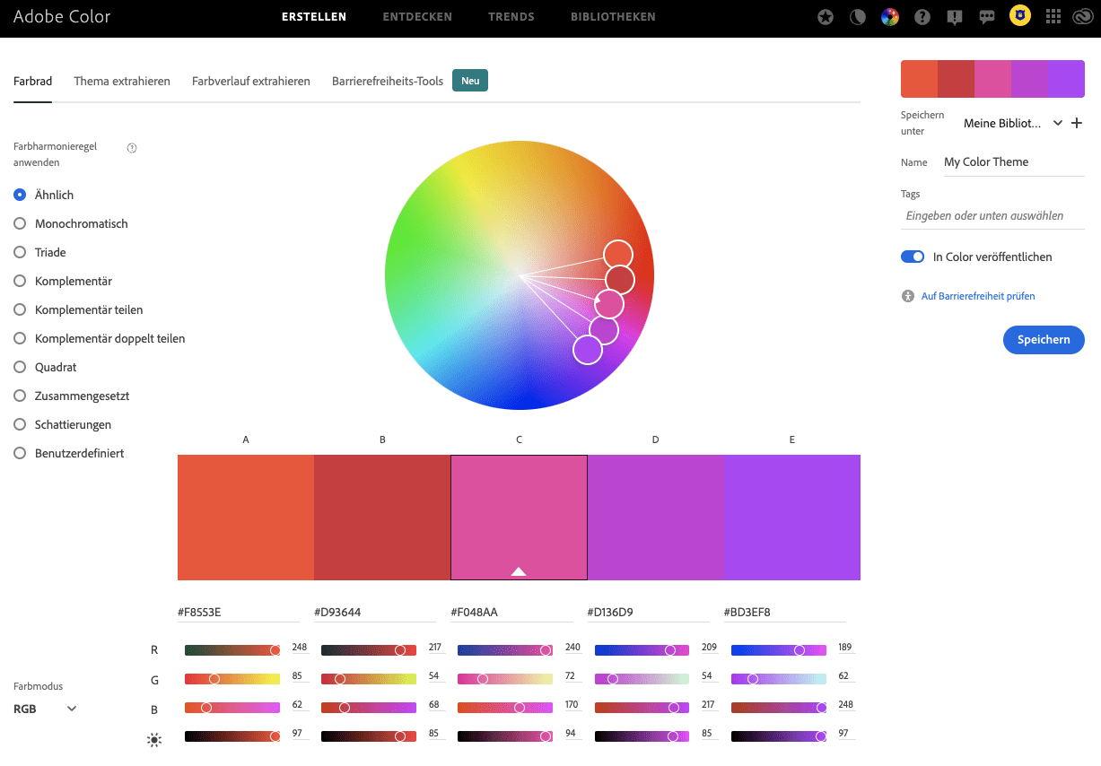
Adobe Color is another tool that can be used to create custom color palettes. It has a feature called “Color Wheel” that allows users to select a base color and generate a complementary color palette based on color theory principles.

ColorSpace
ColorSpace is an AI-based tool that can be used to generate color palettes for branding and logo design. It uses machine learning algorithms to analyze and generate color combinations based on specific keywords or images.

Colormind
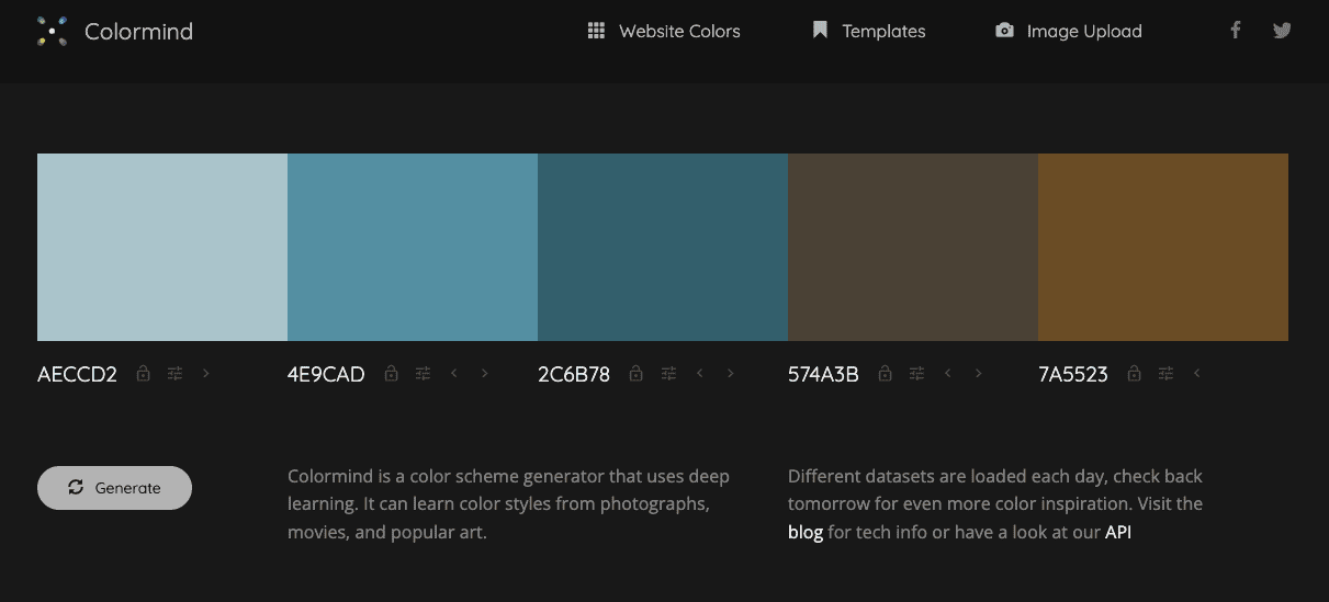
Colormind is an AI-based tool that can be used to generate color palettes for branding and logo design. It uses deep learning algorithms to analyze and generate color combinations based on an uploaded image or user input. It also has a feature called “Color Blindness Simulator” that allows users to see how their color palette would appear to people with color blindness.
Conclusion
In conclusion, selecting the right color scheme for your website can have a significant impact on your brand identity and user experience. By considering your brand identity, using color theory, limiting your color palette, and ensuring accessibility, you can create a cohesive and visually appealing design that resonates with your target audience and enhances their overall experience on your website.
FAQs: Color Schemes
What is a color scheme in web design?
A color scheme is the collection of colors that a designer chooses for their website design. Also known as color palettes, color schemes can include as few or as many colors as the designer sees fit. [6]
How do colors affect user behavior on a website?
Colors can affect users’ emotions and perceptions, which can influence their behavior on your website. For instance, warm colors such as red and orange can create a sense of urgency. Cool colors like blue and green can create a calming effect, while brighter colors like yellow and pink can create a feeling of joy or excitement. [6]
What is the importance of using color theory in web design?
Color theory is essential in web design as it helps designers make informed decisions when selecting color schemes. By understanding color combinations and their meanings, designers can create visually appealing designs that effectively communicate the intended message to the audience. [7]
What is the role of contrast in color design?
Contrast is the difference between two colors and plays a significant role in color design. By using contrast, designers can create emphasis and highlight specific elements on a website. High contrast designs are more visually striking and tend to be more memorable to users. [7]
Can color help establish brand identity?
Yes, color can play a crucial role in establishing brand identity. By selecting a color palette that aligns with the brand’s values and message, designers can create a visual representation of the brand that is instantly recognizable to consumers. Consistently using these colors in all brand communications can help reinforce brand recognition and increase brand loyalty. [7]


